Here are some trade show booth design ideas bound to inspire you and get your creative juices flowing!
Pranil Chandra April 12, 2024
Speak to a Print Expert
Trade show displays are an opportunity to connect with your consumers. Gone are the days where you can simply pop up with portable trade show booths, a couple of chairs and wait for attendees to come up and ask about your product or service. These days, designing creative trade show booths is the way to go!
Consumer behaviour is a fascinating science. You want to ensure you immediately capture brand presence and strategically place your brand for further exploration by your prospects. So how can you do this at trade shows and exhibitions where there is saturation and the risk of not standing out?
Attracting prospects and event attendees with an engaging trade show booth or trade show display will be key in ensuring brand presence. Here at Next, we love to explore the design possibilities and trade show booth design ideas that can make your brand a statement at your next trade show.
Here are some creative trade show booth ideas bound to inspire you and get your creative juices flowing!
Modular exhibition stands have endless design possibilities and are premium trade show booths that consist of three free-standing walls. This style is ideal for use in a high-traffic area, where the unit can be approached from all sides.
This trust fund brand example from Pinterest shows a premium trade show booth complete with flooring, a partial ceiling to hang stylish pendant lights as well as a large back wall for clear branding. There is access from three sides for attendees to browse and engage with your team. This booth design creates the right type of atmosphere – warm and inviting. And considering the type of industry this retirement trust fund belongs, it makes sense to ensure the stand has a warm and inviting feel for prospects.

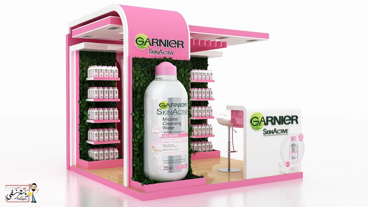
This Garnier skincare stand is an imaginative example of a modular exhibition stand. The oversized product being showcased stands out and makes it clear to attendees the key product being featured. The choice of colour is feminine and bright, and is a reflection of the product’s key target consumer. The green garden wall serves as a backdrop to showcase the products, and the functional shelving prominently displays the actual product in volumes.
Corner stands traditionally have two walls. Sometimes the back is exposed, but largely they have other stands on the back walls so there’s always room to make those two walls stand out!
This Coca Cola exhibit from Pinterest is another great booth design inspiration. This design takes the humble corner stand to the next level with eye catching walls and multiple touch points for attendees to engage with your brand. It also incorporates and accessibility-friendly ramp making it more inclusive. And the use of a colour scheme designed to pop and stand out means that it draw attendees like bees to nectar.

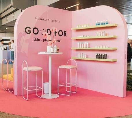
We love this Sephora corner stand. It’s a cool trade show idea and a perfect example of how the right colour palette and clear branding can turn an ordinary corner stand into an extraordinary piece of art. At the same time, it provides functionality with the well-designed cubed shelving to showcase products. The funky yellow chairs add to the pastel aesthetic, giving the impression that these beauty products are youthful, playful and beneficial to the consumer and the planet. We worked closely with The Make Haus to bring this event to life and to see more of what was involved, check out our YouTube video here. What we love about this stand is that less is more, with the use of Reboard® displays, our favourite eco-friendly material.
Single tiered stands can serve as the perfect backdrop for your next event or trade show display.
They usually consist of one freestanding wall with an exposed back. While this option seems to be the most simplest of trade show booth designs, if designed correctly, it can serve as the perfect attraction for attendees.
This Sephora stand in collaboration with The Make Haus is another example of how a plain wall can be transformed into an insta-worthy backdrop. We love the use of the quirky red lip couch as a prop up against the wall, with the accompanying balloons to contrast against the black and white wall art. The addition of neon lights makes this stand too irresistible to not take a selfie with, let alone pass by.

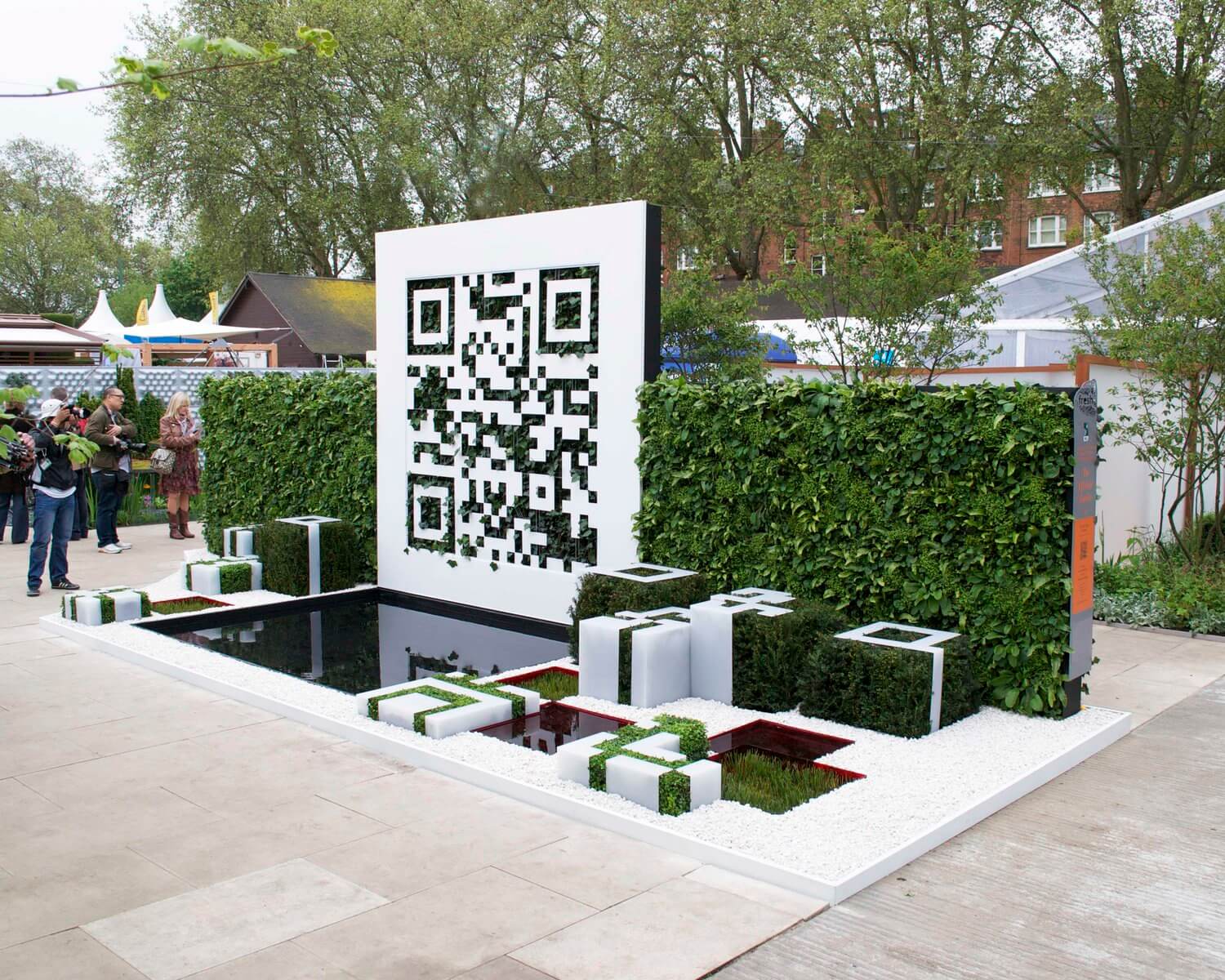
This creative concept of a QR code wall from the Chelsea Garden Show was an innovative way to utilise a single stand. Dark green foliage created the dark spaces of the QR Code – which actually worked! The QR code led to a website giving more information about the garden event and the creative materials used. This inspiration to make trade show booths innovative and interactive is a winning design. And this is a great concept if you have limited dimensions and space to work with. After all, cool trade show displays are all about being resourceful and thinking outside the box!
All these cool trade show ideas serve as inspiration as to what Next Printing can help you achieve, especially when using innovative, eco-friendly Reboard®.
We love to bring your creative vision to life and can help you get started from as early as conception stages.
Pick and choose from our broad range of services, all tailored to your needs:
If you want to create cool trade show displays, browse our pre-designed options here, or contact us today and speak to one of our experts.
We'd love to send you innovative tips, news and offers from the world of print and marketing.
Client experience officers are available to answer any questions you have. Use the form below to quickly let us know what you need!